
The Rise& Fall of Neumorphism | 매거진에 참여하세요
The Rise& Fall of Neumorphism
#Design #Trends #Neumorphis #Skeuomorph #FlatDesign #Minimalism #UXTrends #Glassmorph #PastelUI


The Rise and Fall of Neumorphism: A Beautiful but Brief Chapter in Design
Design trends are like waves—some ripple quietly while others crash loudly before fading away.
Somewhere between the flat design revolution and a nostalgic nod to skeuomorphism, a new aesthetic quietly took the design world by storm: Neumorphism.
Dubbed the “New Skeuomorphism,” this soft, pastel-toned, semi-realistic design style gained momentum on platforms like Dribbble and Behance
in 2019 and 2020. Its signature?
An odd but charming mix of minimalism and tactile realism. Buttons looked subtly raised, like they were molded into soft clay.
Cards seemed to swell gently from their backgrounds.
It was modern. It was dreamy. It was... short-lived.
Let’s explore how neumorphism emerged, why it caught designers' imaginations for a moment, and what led to its early demise.
The Birth of Neumorphism: A Soft Rebellion
Neumorphism emerged as a reaction—designers had grown weary of semi-flat, overly minimal UIs. Many longed for more visual depth and texture. Neumorphism responded by blending two opposing forces: the realism of skeuomorphism and the clarity of minimalism.
To understand it, you need to understand what came before.
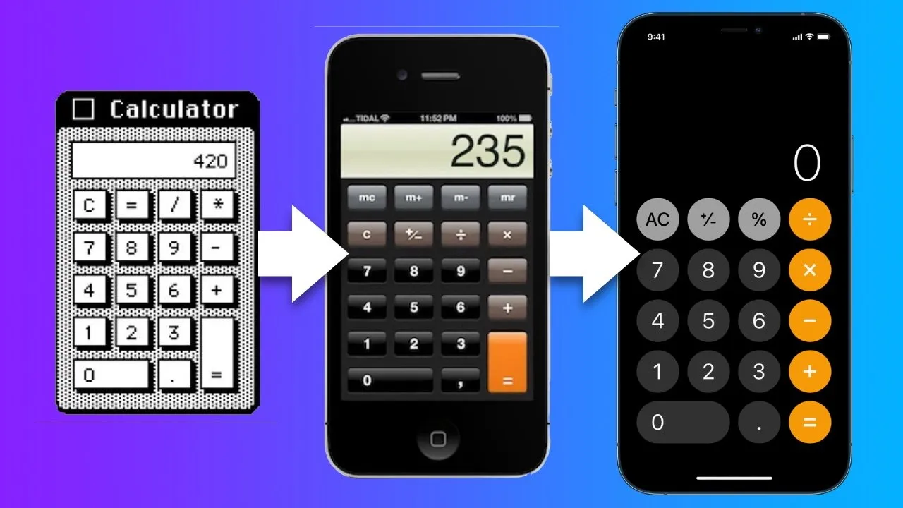
Skeuomorphism,
made famous by early Apple iOS interfaces, mimicked real-life textures and materials: stitched leather calendars, shiny toggle switches, and felt-lined folders.
Flat design,
which replaced skeuomorphism around iOS 7, stripped all that away in favor of clean, simple, two-dimensional visuals.
Neumorphism proposed a middle ground: minimal layouts with subtle light and shadow effects that hinted at depth, without fully simulating reality. It created a kind of “soft realism,” where buttons and input fields felt embedded or slightly inflated within their surfaces.
It was elegant. It was futuristic. And it looked amazing in static mockups.
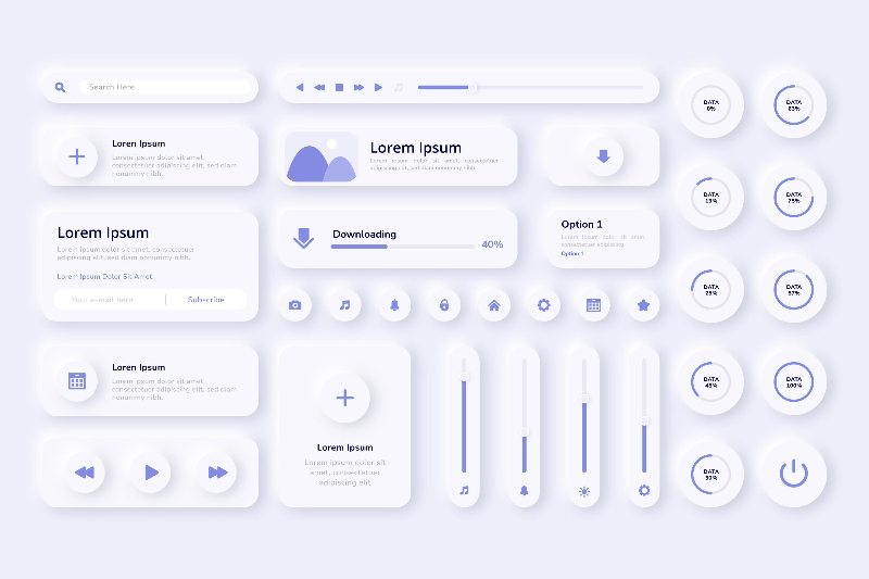
How Neumorphism Works (and Looks)
At the heart of neumorphic design is light—or more specifically, dual shadows.
A neumorphic element typically has:
A light shadow on one edge (like a highlight),
A dark shadow on the opposite edge,
A monochromatic background, often in pastel or light gray tones.
Here’s a typical CSS snippet:
.neumorphic { background: #e0e0e0; border-radius: 10px; box-shadow: 5px 5px 10px #b8b8b8, -5px -5px 10px #ffffff; padding: 20px; } In Figma, designers would often stack multiple drop shadows with differing colors and blur radii to simulate a light source from the top-left.
Neumorphism thrived in card components, onboarding screens, and concept UIs. It was soothing.
It was tactile. It felt like UI made of marshmallows.
So... what went wrong?
The Fall of Neumorphism: Why It Didn’t Stick
Despite its visual appeal, neumorphism never made the leap from Dribbble dream to production reality. Here’s why:
1. Accessibility Issues
Neumorphism relies on low contrast by design.
Elements often blend into their backgrounds, making it difficult to distinguish buttons, input fields, or states.
For users with visual impairments or color blindness, this is a major problem.
2. Implementation Complexity
Building neumorphic UIs in code isn’t impossible—but it’s not easy either.
Most mobile platforms and design systems aren’t optimized for this look, meaning more custom work for developers and inconsistent behavior across devices.
3. Poor Compatibility with Dark Mode
Neumorphism works best on light backgrounds, where shadows and highlights can be clearly rendered.
But with dark mode becoming a UX standard, neumorphism becomes hard to maintain or replicate effectively.
In short: beautiful in theory, difficult in practice.
What Came After Neumorphism?
Even as neumorphism faded, its core idea—realism reimagined—continued to evolve. Two newer trends have picked up the baton:
Glassmorphism
Made popular by macOS Big Sur and Windows 11, glassmorphism emphasizes frosted glass effects, blurred backgrounds, and vibrant colors behind transparent layers. It preserves some of neumorphism’s softness but improves usability with better contrast and layer separation.
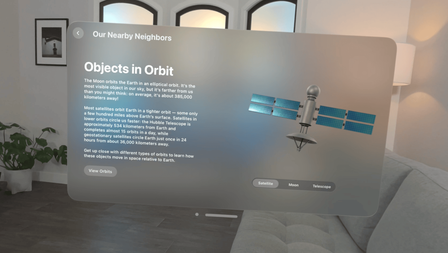
Skeuomorphism 2.0 (Hyper-Realism)
With the rise of VR and metaverse environments, hyper-realistic UI components are making a comeback.
Think high-res textures, 3D-rendered buttons, and UI elements that simulate real-world tactility.
If early skeuomorphism helped users understand smartphones, this new wave is helping users navigate immersive digital spaces.

Final Thoughts: Neumorphism as a Design Experiment
Neumorphism may not have become a standard, but it served an important role: it reminded us that visual delight still matters.
In a world overrun by sterile, interchangeable interfaces, neumorphism offered a breath of fresh air—albeit briefly.
It pushed the boundaries of what flat design could look and feel like, and seeded the path for new hybrids like glassmorphism and hyper-real UI.
Design trends come and go, but each leaves behind lessons. Neumorphism’s lesson?
Form is fun, but function is non-negotiable.
We’ll continue to see new styles that flirt with realism, minimalism, nostalgia, and futurism.
Some will fade quickly, others will evolve into new standards.
But every experiment, even a fleeting one like neumorphism, shapes the future of design.
So the next time a new UI trend appears, don’t just ask “Is it beautiful?” Ask:
“Does it work—for everyone?”

- link_kakaolink_kakao_url
- link_operatorlink_operator_url
- link_investhelp@letspl.me
- link_ad_urllink_ad
